August 26, 2007
The Station Agent
The plan was to head to Blockbuster to pick-up a weekend distraction. Katie thought it might be fun to grab the first two Borne movies and then head to the theater to the third. Apparently we were not the only ones with this idea because the store was fresh out. Instead we wandered around looking for something else to take home. In the independent film aisle, we grabbed The Station Agent, a movie we both vaguely remembered something about but had never seen. The plot focuses on Fin, a little person, who relocates to an abandoned train depot. Despite his best efforts, he gets swept into the lives of a few eccentric locals. It turned out to be a very enjoyable film. There's this character Joe played by Bobby Cannavale who is one of the most entertaining people i've seen on screen. The movie was originally released in 2003 but if you haven't seen it yet you should check it out. And you don't have to take my word for it -- it's certified fresh by Rotten Tomatoes.
August 21, 2007
Bio-bootcamp
My semester has begun. I'm taking a class offered by the UM Bioinformatics department called "Basic Biology for Graduate Students with Quantitative Training" (BIOINF 523). The class has the nickname of "bio-bootcamp." So far we've covered types of atomic bonds, the structure of DNA, the central dogma of molecular biology, protein folding and more. We're also getting hands-on experience with lab techniques. On Monday we collected our own saliva and today we extracted the DNA from it. Tomorrow we will replicate a particular gene and then analyze it using gel electrophoresis. Bootcamp only runs through next Tuesday so it's over before the rest of my classes begin. I just hope the rest of them are this much fun.
August 14, 2007
Quick Ann Arbor update
Since the weather has cooled down a bit, i've done some more exploring here in Ann Arbor. This weekend i hit up most of the college bookstores in town looking for a copy of a particular text. You see, there's not one official textbook store for the college, there are a bunch so i did quite a bit of walking. I ended up not finding the book i was after (it wasn't for a particular class, it was just to be used as a reference) and just ordering a used copy from half.com when i returned home. The trip wasn't a total waste because i did scope out the best deals and selections for Michigan apparel and gifts. I think the oddest thing i found was a Michigan pizza cutter that automatically plays the fight song when you use it - "no need to push buttons!" the box informed me.
And then on Monday the database server where all my data is stored was down because it was being relocated to a new high tech facility. Since i couldn't really work without it, i took the afternoon off. I ended up wandering up and down Main St. They have a bunch of cool gifts shops such as 16 Hands, Peaceable Kingdom, Falling Water and The Thousand Villages. I concluded my northward journey at the Kerrytown shops. I think Christmas shopping will be a lot easier this year.
This morning campus safety sent an e-mail to the department informing us that one of the labs in my building had been "compromised" by two men late last night. Also mentioned in the e-mail was that earlier this month some man had tried to gain entrance to a restricted lab by claiming to be a member of a "bomb detonation unit" before being sent off. I had no idea the School of Public Health would be such a dangerous place to work.
August 06, 2007
Hold the elevator buttons
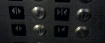
OK, here's a poor quality picture of some of the buttons in the elevator i take to my floor at school each day.

These buttons are supposed to close and open the elevator doors. What i don't understand is why there are two pairs of them. Now this elevator does have two sets of doors, front and back, but i'm not sure why i would want different buttons to control the different openings (if one door opens, might as well open the other because you're going to have to wait anyway) nor do i know which buttons manipulate which door. The only difference is the line down the middle and i don't know what that is supposed to mean.
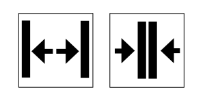
My other problem with the buttons is that i can't tell quickly which is open and which is close. Usually if i'm going to press the door open button it's because someone has yelled "hey, hold the elevator" and i need to act fast before the doors slam shut in their face. I think i experience some cognitive friction because the "close" button is the more "open," or less dense. My mind thinks the thick arrows at the outer edges look like a set of open doors. I guess when i'm looking for the button quickly, i'm looking for something that resembles a set of open doors and i usually head for the wrong button. I bet i wouldn't be complaining had they just labeled the buttons with the words "open" and "close."
I'm no designer but i've whipped up a new button design that i think would be less confusing.

So am I the only one who has a problem with elevator buttons?
UPDATE: Nope, i'm not the only one. I did some more digging and found quite a few other people who shared their proposed solutions. You can find other alternative designs, a patent for a flashing door close button, and a suggestions to change the size of the button.
August 01, 2007
Lights, camera, dance
I love all the work that goes into producing live theatre, especially the lighting designs. I think that's why i notice the lights when catch the hit summer reality show So You Think You Can Dance. I think their lighting designers do a really nice job of differentiating each of the numbers and making the stage look as different as possible. So much so that i felt compelled to make this post at the risk of being mocked for admitting to watching the show. While subtle it not their style, i think they do a really good job of matching the lights to the mood of the piece plus they move with the music rather than staying static. I'm sure they have very little time to pull it all together. Boy would i love to help program that light board sometime.