August 06, 2007
Hold the elevator buttons
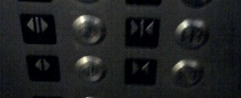
OK, here's a poor quality picture of some of the buttons in the elevator i take to my floor at school each day.

These buttons are supposed to close and open the elevator doors. What i don't understand is why there are two pairs of them. Now this elevator does have two sets of doors, front and back, but i'm not sure why i would want different buttons to control the different openings (if one door opens, might as well open the other because you're going to have to wait anyway) nor do i know which buttons manipulate which door. The only difference is the line down the middle and i don't know what that is supposed to mean.
My other problem with the buttons is that i can't tell quickly which is open and which is close. Usually if i'm going to press the door open button it's because someone has yelled "hey, hold the elevator" and i need to act fast before the doors slam shut in their face. I think i experience some cognitive friction because the "close" button is the more "open," or less dense. My mind thinks the thick arrows at the outer edges look like a set of open doors. I guess when i'm looking for the button quickly, i'm looking for something that resembles a set of open doors and i usually head for the wrong button. I bet i wouldn't be complaining had they just labeled the buttons with the words "open" and "close."
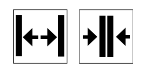
I'm no designer but i've whipped up a new button design that i think would be less confusing.

So am I the only one who has a problem with elevator buttons?
UPDATE: Nope, i'm not the only one. I did some more digging and found quite a few other people who shared their proposed solutions. You can find other alternative designs, a patent for a flashing door close button, and a suggestions to change the size of the button.
Posted by Matthew at August 6, 2007 08:44 PMThis might be the nerdiest thing I've ever seen from you.
Posted by: Jeff at August 6, 2007 10:06 PMI wish that was the nerdiest thing I've ever heard from you
Posted by: Dawn at August 10, 2007 01:56 PM